How to structure Shopify product pages so shoppers understand the offer, trust the brand, and add to cart with less friction—including below-the-fold objection handling when AI-referred sessions land on your PDP.
How to Optimize Your Shopify Product Page (PDP) for Conversions
Prefer reading? Continue below.
Quick Answer
Shopify product page optimization improves conversion by clarifying the offer above the fold, placing proof near the buy box, simplifying variants, and removing mobile friction that blocks add-to-cart. When ChatGPT, Perplexity, or other AI assistants send shoppers to your PDP, keep the first viewport fixed and add two or three objection-handling modules below the fold—FAQs, specs, or shipping and returns—after segmenting referrer data in Shopify Analytics or GA4.
Why Do Product Pages Decide Most Shopify Revenue?
On Shopify, a large share of paid and organic traffic lands directly on product pages. That means the PDP is often the entire sales conversation. If the first screen does not answer what the product is, why it is worth the price, and how to buy it, paid traffic leaks before your brand story ever loads.
Product page optimization is therefore one of the highest-ROI Shopify CRO projects. It compounds across every campaign that points at those URLs—and across referral channels, including AI assistants that send buyers straight to product pages.
What Belongs Above the Fold on a Shopify PDP?
The first viewport must communicate product identity, primary benefit, price, available options, and a clear call to action. Supporting story can live lower on the page. The buy decision starts immediately.
Primary image that shows the product in a recognizable context.
Concise title with readable pricing and compare-at only when honest.
Variant selectors that do not hide size or color availability.
Primary add-to-cart button with strong contrast and adequate tap size.
One short line of shipping or delivery expectation near the CTA.
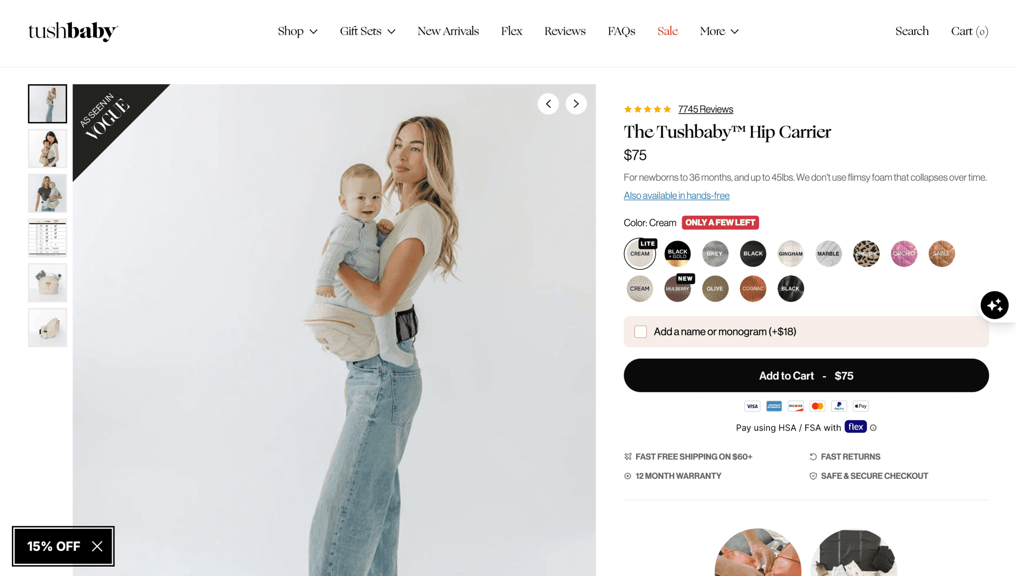
From a Tushbaby PDP audit: reviews and trust cues sit near the buy box, variants are scannable, and the primary CTA stays unmistakable. We validated follow-on redesigns with Intelligems A/B tests and saw conversion lifts.
Gallery order should move from clarity to desire: hero shot, detail, lifestyle, then proof or packaging. Avoid burying the true product appearance behind lifestyle-only imagery. Video helps for complex products, but a silent autoplay clip should never replace a clear still.
How Should Product Page Copy Be Structured?
Effective PDP copy is scannable. Lead with outcomes, then support with features, fit guidance, and use cases. Dense paragraphs without hierarchy cause mobile bounce even when the product is strong.
Open with who the product is for and the primary outcome.
List differentiators as short bullets, not a feature dump.
Add fit, sizing, or compatibility guidance before objections escalate.
Place FAQs or care details after proof and closer to purchase hesitation points.
Metafields help keep this structure consistent across large catalogs. When product attributes vary, structured data is more maintainable than one-off rich text—see the Shopify metafields guide for implementation patterns.
Where Should Trust Signals Go on the Product Page?
Reviews, guarantees, and payment trust marks work best near the buy box—not only in a footer or a disconnected reviews tab. High-consideration products also benefit from expert quotes, UGC, or specification tables that reduce uncertainty.
For a fuller trust-system approach across the storefront, pair this guide with the Shopify trust signals guide.
What Should Change When AI-Referred Shoppers Land on Your PDP?
Shopify's Q1 2026 commerce data shows a different landing pattern for AI-referred traffic: more than half of those sessions start on product pages, compared with roughly 20% from organic search. On PDP landings specifically, AI-referred sessions converted at nearly 50% higher rates than organic PDP sessions in the same period—aggregate platform data, not a guarantee for every store.
Merchants are asking the right follow-up question: if ChatGPT or Perplexity sends a buyer who already narrowed their choice, what should change on the PDP? The answer is usually objection handling below the fold—not more lifestyle imagery or schema tutorials. These visitors are humans finishing a compressed research journey, not bots reading your markup.
Keep the First Viewport Fixed
Above-the-fold rules do not change for AI-referred traffic. Product identity, price, variants, primary add-to-cart, and a rating summary near the buy box stay fixed—the same standards from the above-the-fold and trust sections of this guide.
Anti-pattern: stacking FAQ accordions, comparison tables, or app widgets above the fold because AI sent the click. That adds clutter for a shopper who already chose your SKU and pushes the buy box down on mobile.
Module Priority Below the Fold
When referrer data shows strong add-to-cart intent but lingering objections, prioritize scannable modules that answer fit, compatibility, shipping, and spec questions—below the first viewport.
Module
Priority for AI-referred sessions
Typical placement
Defer when
FAQ accordion (fit, compatibility, materials)
High
Below first viewport, before long-form story
Questions already answered above fold
Spec / comparison table
High
Mid-page, scannable
Duplicates variant selector info
Shipping & returns near CTA
High
Adjacent to or directly under buy box
Policy is generic and already in footer
Review depth / UGC gallery
Medium
Mid-page after proof summary
Rating summary already strong above fold
Lifestyle carousel / brand story
Low
Below decision-critical blocks
AI-referred sessions show high ATC with low scroll
Redundant app widgets (quiz, pop-up, chat)
Defer
—
Competes with ATC on mobile
Measure Before You Rearrange the Template
Segment Shopify Analytics or GA4 by referrer before changing the template. Filter for ChatGPT, Perplexity, Gemini, Copilot, Claude, and grouped other AI referrers where sample size allows. Compare PDP add-to-cart rate and conversion rate for AI-referred versus organic PDP landing sessions first.
Establish a baseline for AI-referred PDP sessions before adding modules.
Re-measure after 2–4 weeks; low-volume referrers need longer windows.
Pair referrer segments with device and new-vs-returning cohorts so mobile friction does not hide in averages.
For broader funnel diagnosis and experiment habits, see the Shopify conversion rate optimization guide—this section stays focused on PDP module prioritization, not a full analytics walkthrough.
Machine and citation readiness—structured product data, llms.txt, agent cart endpoints—belongs in the Shopify AEO guide and the Shopify agentic checkout checklist. This section covers human conversion UX when AI assistants send shoppers to your PDP. Do not duplicate agentic infrastructure checklists here.
How Do Variants and Bundles Create Conversion Friction?
Confusing variants are a silent conversion killer. Missing size charts, sold-out options that still look selectable, and unclear bundle contents create hesitation. Subscriptions and upsells should feel like helpful choices, not roadblocks before the primary CTA.
Disable or clearly mark unavailable variants.
Show selected variant image swaps instantly.
Explain what is included in bundles before price comparison.
Keep secondary offers visually subordinate to add-to-cart.
What Mobile PDP Patterns Convert Best?
Most Shopify traffic is mobile. Sticky add-to-cart bars help when implemented cleanly, but they fail when they cover important content or compete with chat widgets. Compress vertical space above the fold without making the page feel cramped.
Test thumb reach for variant chips and ATC. Reduce app overlays that interrupt the first five seconds. If mobile conversion lags desktop dramatically, product page mobile UX is often the first place to look—alongside the issues covered in Shopify conversion issues that hurt revenue.
A Product Page Optimization Checklist
Use this checklist on every high-traffic template before launching major campaigns.
Area
Pass criteria
Offer clarity
Value prop readable in under 5 seconds
Proof
Rating or trust cue visible near buy box
Variants
Selection and stock status unambiguous
Mobile ATC
Primary CTA always reachable
Speed
Key content interactive quickly on mid-tier phones
✓Most Shopify conversion is won or lost on the product page, especially for paid traffic.
✓Above-the-fold clarity beats long brand storytelling for first-session buyers.
✓Place trust and reviews near the buy box, not only lower on the page.
✓AI-referred PDP sessions often convert higher but still need objection handling below the fold—measure by referrer before adding modules.
✓Variant and bundle confusion creates hesitation even when creative is strong.
✓Mobile ATC patterns and app overlays deserve dedicated testing.
✓Checklist high-traffic PDPs before campaign spend scales.
Frequently Asked Questions
How long should a Shopify product description be?+
Long enough to answer objections, short enough to scan. Lead with a tight benefit summary above the fold, then expand with details, specs, and FAQs below. Length without hierarchy hurts conversion.
Should I put reviews above the fold?+
Show a rating summary and a compact proof cue near the buy box. Full review grids can live lower, but buyers should see social proof before they decide to scroll away.
Do product videos increase Shopify conversion?+
They often help for products that need demonstration, fit, or texture. Keep a clear still image first, and ensure video does not delay core page interactivity.
What is the biggest product page mistake brands make?+
Assuming shoppers will dig for information. Hidden shipping details, vague titles, weak imagery, and buried proof create drop-off even when the product itself is excellent.
How often should I update product pages?+
Review top sellers monthly or after major promo periods. Update whenever reviews reveal new objections, when variants change, or when analytics show rising bounce or falling ATC.
Should I redesign my Shopify product page for AI-referred traffic?+
Usually not above the fold. Keep product identity, price, variants, and primary add-to-cart fixed. If Shopify Analytics or GA4 shows high add-to-cart intent with lingering objections from ChatGPT, Perplexity, or similar referrers, add two or three high-signal modules below the first viewport—FAQs, specs, or shipping and returns—not lifestyle carousels or redundant app widgets. Citation and agentic readiness is a separate audit in the Shopify AEO and agentic checkout guides.
Continue Learning
Related guides, real Zqdo project examples, and the category hub for deeper exploration.
David Frempong is the founder and digital consultant at Zqdo. He is a hands-on web developer and Shopify developer who helps ecommerce brands and local businesses improve their websites, integrations, SEO, AEO, analytics, and conversion performance.